Timeframe:
Currently Working On It
My Role:
UI/UX Designer
Tools:
Adobe XD
Fonts Elements Wireframes Prototyping Site Map Color Palette
Problem
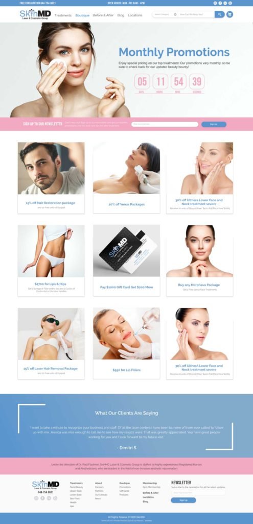
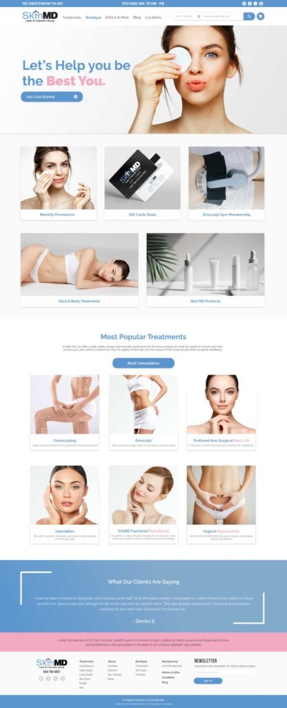
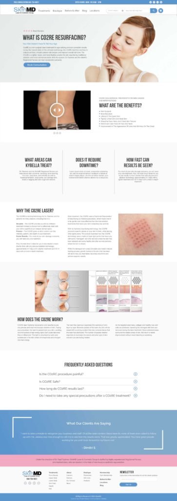
As shown in the images below, the website is outdated. We found that there were too many tabs with redundant information that confused and distracted the user making them leave the page. There was no hierarchy within the design or continuous flow that help the user navigate the site. Lastly, we found that new customers that land on the website will be lost on the terminology unless they were familiar with the procedure’s name.
Solution
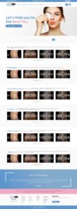
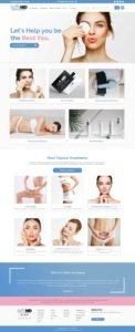
Our solution was to re-arrange the content for the entire website by organizing the navigation. Create a mega menu that will display all 30+ treatments broken down into body sections that will allow users to learn more about the procedure. Lastly, implement a filtering system to help new or existing customers find the best treatments for the selected body area, and provide them accurate information to help them book consultations.
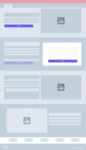
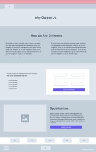
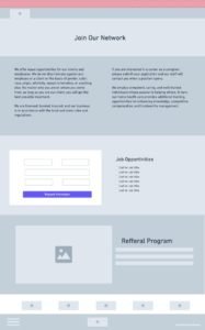
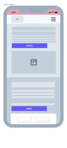
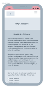
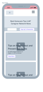
Wireframes

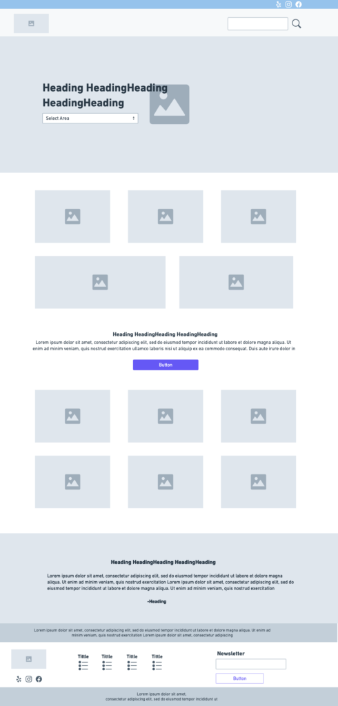

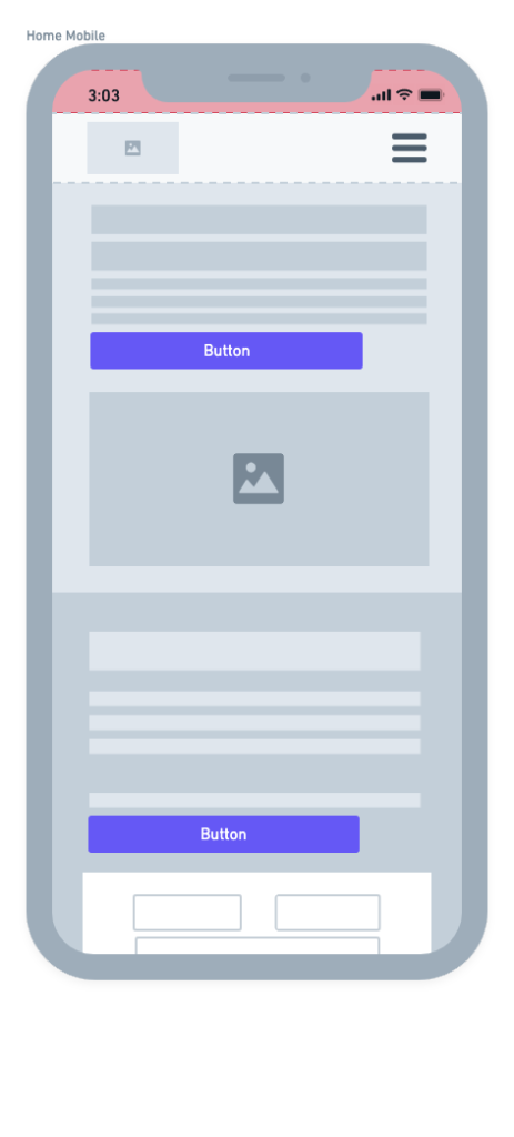
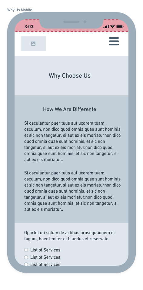
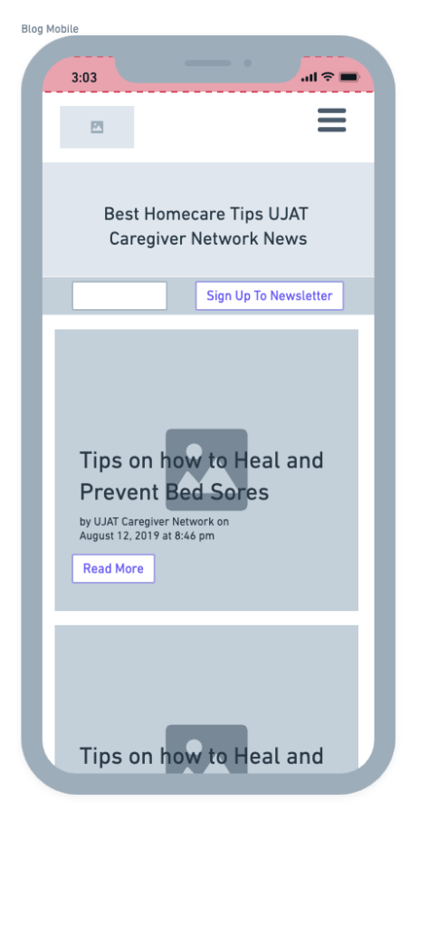
Wireframes
Future Goal
- Testing functionality in staging to make the product live.
- Conduct usability tests to see the user’s interaction with the website.
- Perform heat mapping to improve interaction with the page.
- Update the mobile experience to be user-friendlier.








 Toggle Content