Timeframe:
2 Month
Goal:
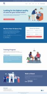
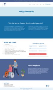
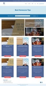
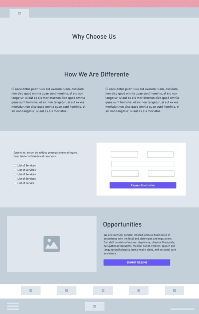
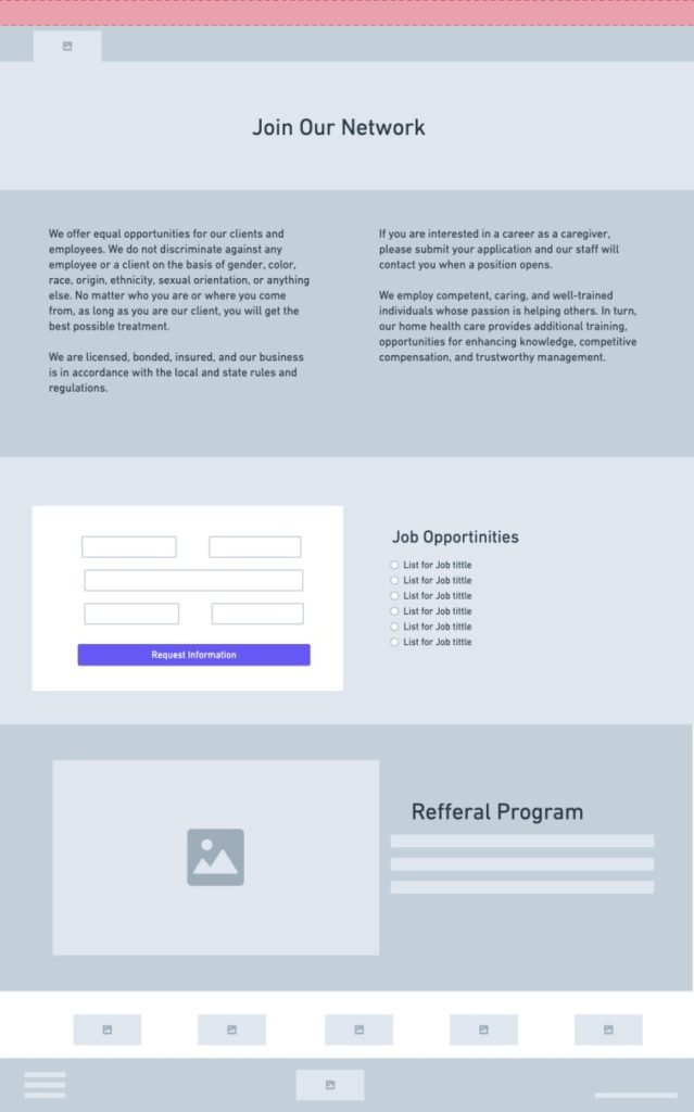
Re-design the website providing users a modern and friendlier experience that will help them get information for each service.
My Role:
Web/UI Designer
Tools:
Adobe XD
Methods:
Fonts
Elements
Wireframes
Prototyping
Site Map
Color Palette
Usability Tests
Problem
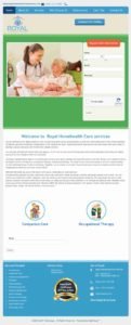
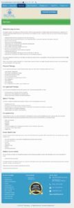
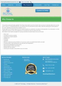
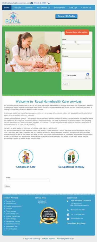
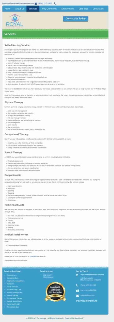
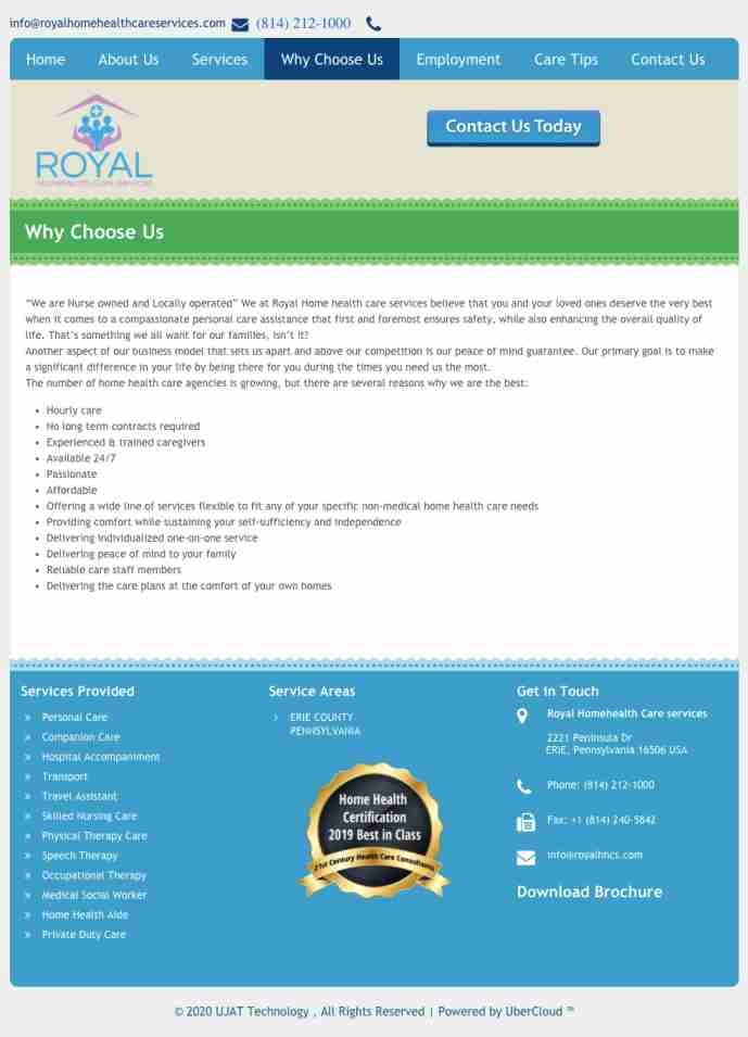
As shown on the images below, the website is outdated. We found that there were too many tabs with redundant information that confused and distracted the user making them leave the page. There was no hierarchy with in the design or continuing flow that help the user navigate the site.

Problem
As shown on the images below, the website is outdated. We found that there were too many tabs with redundant information that confused and distracted the user making them leave the page. There was no hierarchy with in the design or continuing flow that help the user navigate the site.
Solution
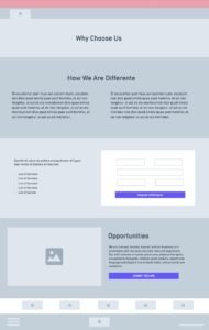
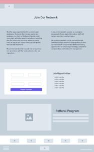
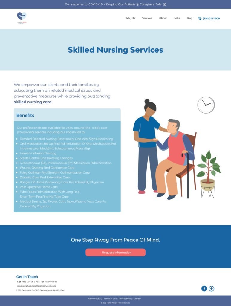
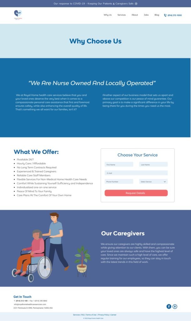
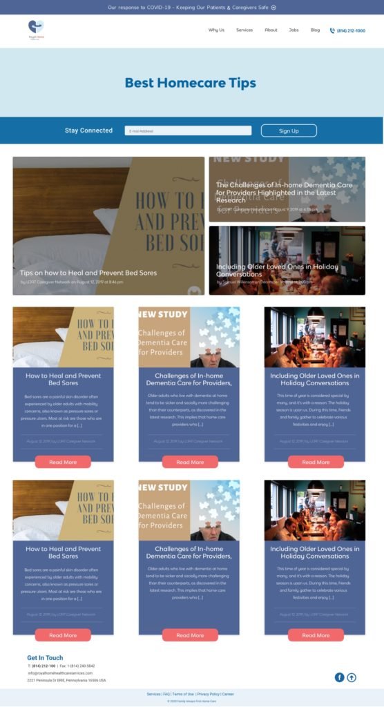
Our solution was to create re-arrange the content for the entire website. This will include creating a drop down menu for the service tab, creating new pages for each service. This will give the users a chance to learn about each service RHHC provides to reach out for further details or questions.
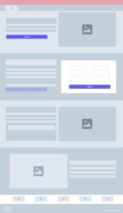
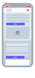
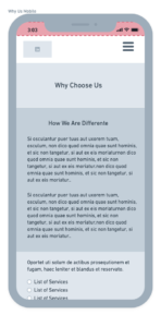
Wireframes
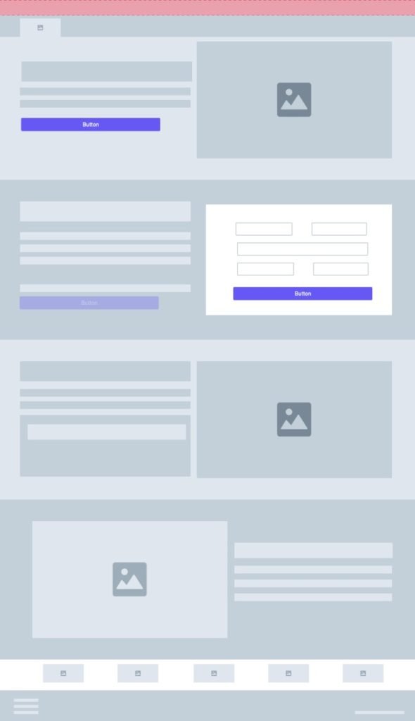
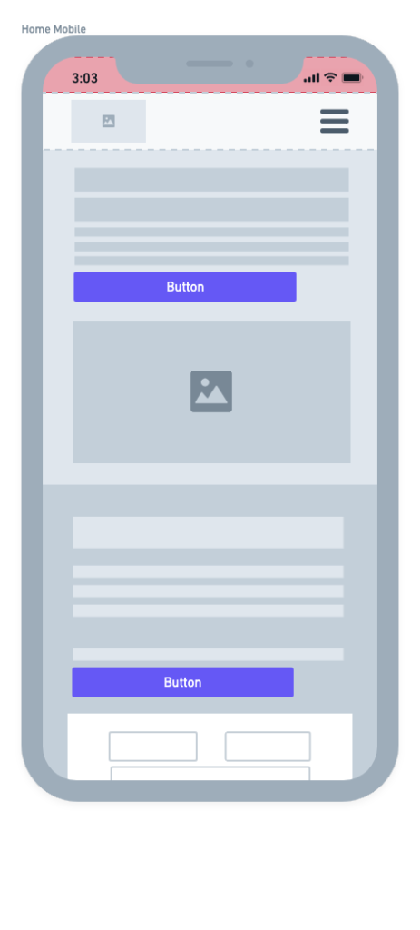
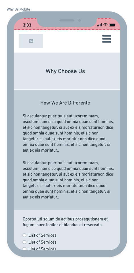
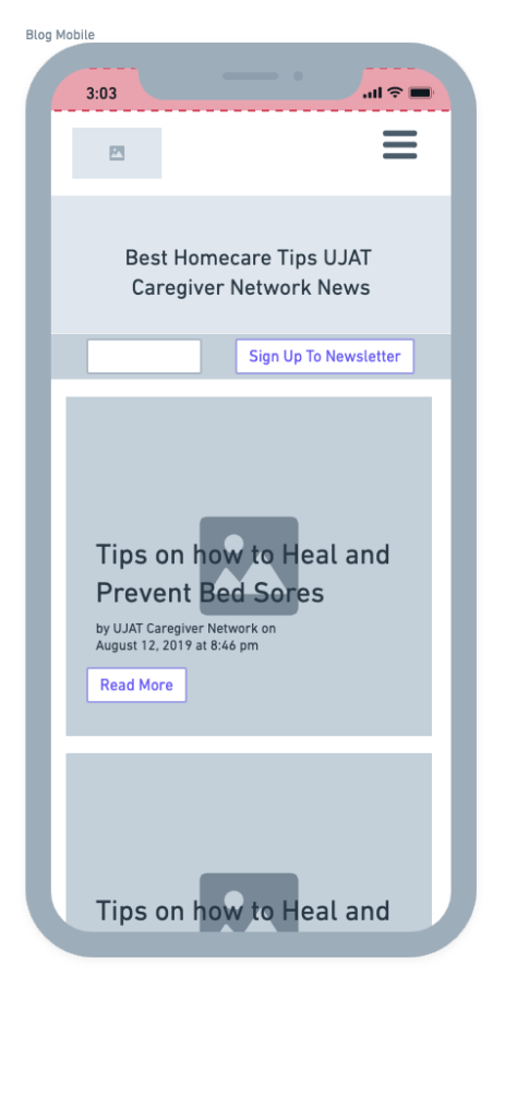
Wireframes
Future Goal
- Conduct usability test to see users interaction with the website.
- Perform heat mapping to improve interaction with the page.
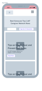
- Update the mobile experince to be more user friendlier.
